Herbert W. Franke & Casey Reas
An intergenerational conversation between two significant figures in computer art.
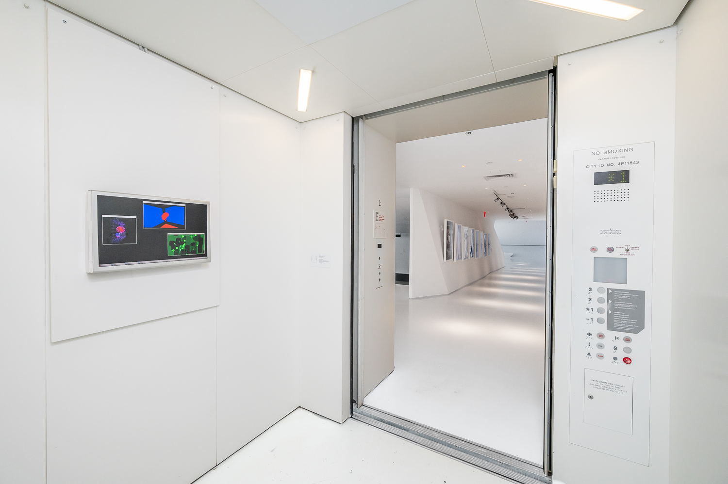
How do you design an exhibition of digital art? Since the early twentieth century, different forms of new media—from moving image to AR and VR—have made their way into museum and gallery displays. For curators and exhibition designers working with art and technology today, there is a rich history to draw on and adapt. But along with the arrival of web3 and NFTs, there has been a notable uptick in hastily assembled installations that betray a fundamental lack of understanding about digital technologies and exhibition design. Pixelated images, mismatched monitors and aspect ratios, inappropriate screens—these are just some of the common issues. Outland brought together Regina Harsanyi, a time-based media specialist and associate curator at the Museum of Moving Image in New York, and Craig Barrow, a Berlin-based artist and designer, to discuss these problems and possible solutions. Harsanyi talked about organizing “Refreshing the Loop,” an exhibition of artist-made gifs in a passenger elevator (at the Museum of Moving Image through January 14, 2024), and Barrow related his experiences of designing shows for Refraction DAO’s festivals in New York and Miami. They also considered the questions that come up when designing online and virtual environments for art.
CRAIG BARROW I come from a design background—objects, furniture, that sort of thing. At university I was on a course called 3D design, which back then meant the design of three-dimensional objects, not computer-based design, and so the teaching was very hands-on. It was about understanding the physicality of materials, how and why we interact with objects, the emotions or concepts they can generate. But also there was always a functional element: furniture and objects have to work in spaces.
Over the course of my career, I’ve done furniture design, production design, set design, installation design, and more art-based sculptures and installations. I’m doing a lot of exhibition design with Refraction at the moment. A friend of mine, Tabitha Swanson, who is a member of the DAO, had posted on Instagram saying they were looking for an exhibition designer. I wasn’t so aware of how web3 and DAOs worked, and it’s been great discovering all the creativity in the space.
My interest in exhibition design, I think, has come from the journey of making objects for homes and galleries. To understand how an object can affect a space, and how a space can affect an object, you always have to consider how it’s seen and how it’s received. As an artist, I’d have more control over the object; now, as an exhibition designer, I have more control over its environment. It’s useful to be aware of both sides so you can try to harmonize them.
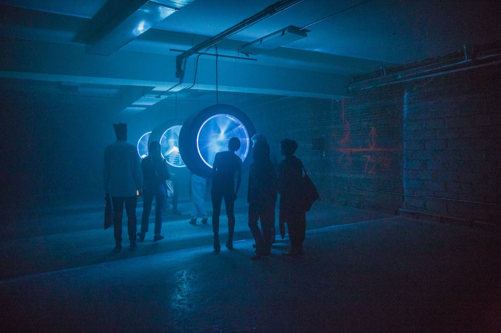
HARSANYI I was a registrar and operations associate for two years at Sotheby’s in New York, one year of which overlapped with graduate school. Part of that was managing art handlers when they installed works in the auction house ahead of a sale. I had interned at Christie’s and Pace/MacGill before that, but Sotheby’s was my first real involvement with exhibitions being put up and taken down, and it was at a rapid pace, changing every two weeks. When I finished graduate school, I applied to work at Wallplay, because I had read an article about them and had seen how amazing their time-based media installations were. I remember in particular a photo of an installation they did at Industry City in Brooklyn, by a group called Hovver, called Liminal Scope. I was promptly thrown into the deep end as Wallplay’s associate director.
At Wallplay, we convinced landlords to let us to take over their vacant spaces instead of taking the tax break. Then we put emerging artists, primarily those working with digital technologies, in the spaces. We had about twenty-six different spaces across New York City on usually year-long contracts. So I went from Sotheby’s, which had these crazy turnarounds, and then jumped into spaces that were not meant to show artwork at all—rickety ceilings, brick walls, concrete floors, not the kind of lighting that you would ever want for exhibition—and then we somehow turned these store fronts into a space that might convince a passerby to walk in. It was a crash course in how to exhibit work in alternative spaces. I almost wish anybody interested in exhibition design or curation would be forced to do what I did for over two hundred shows in four years. If you can install on concrete and you don’t have access to drywall and proper lighting, then you can do anything.
My current role at Museum of the Moving Image is in a very different environment. We are fortunate to have a director of exhibition management and design and we can, more often than ever in my life, start on projects one to three years before they open. We have more resources to build whatever we need to show, within reason. It means I can make sure it gets as close as possible to the artist’s vision, which is important to me. I’ve lectured a lot on improper display of born-digital artwork, like when the monitor doesn’t fit the aspect ratio of the work, or if a TV screen is used to show a net-based work. Curators and exhibition designers aren’t always having the necessary technical conversations with artists about how their work was intended to be shown.
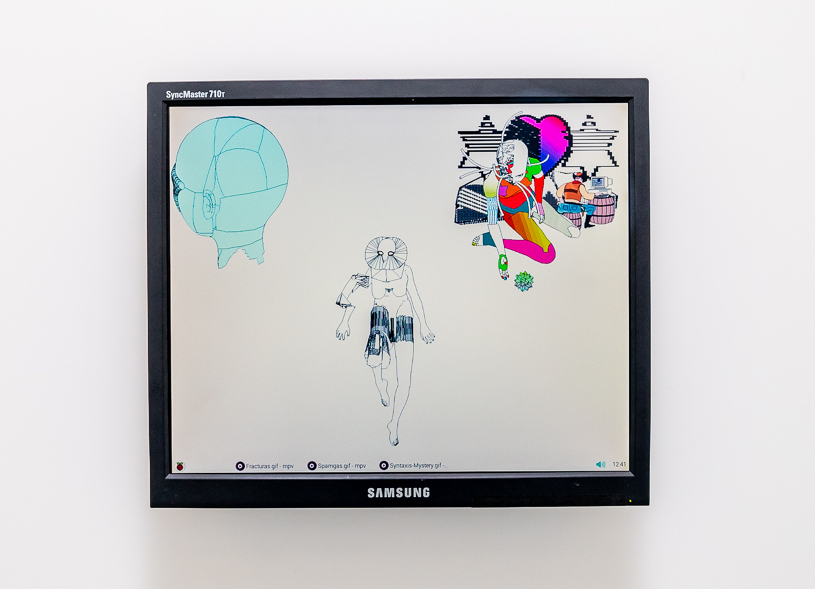
I’ve recently been working on a show called “Refreshing the Loop,” which includes a series of artists working with gifs, in the museum’s elevator—which is of course a strange place to install a show. I asked each artist exactly what make and model of computer they used to create their gifs in their studios. Many of them were obsolete, but we worked with a great e-recycling company called 4thBin, and scoured eBay, to find the original (or close to the original) computer monitors. We’re then using a Raspberry Pi microcomputer to load the actual gifs, displayed directly on the desktop background.
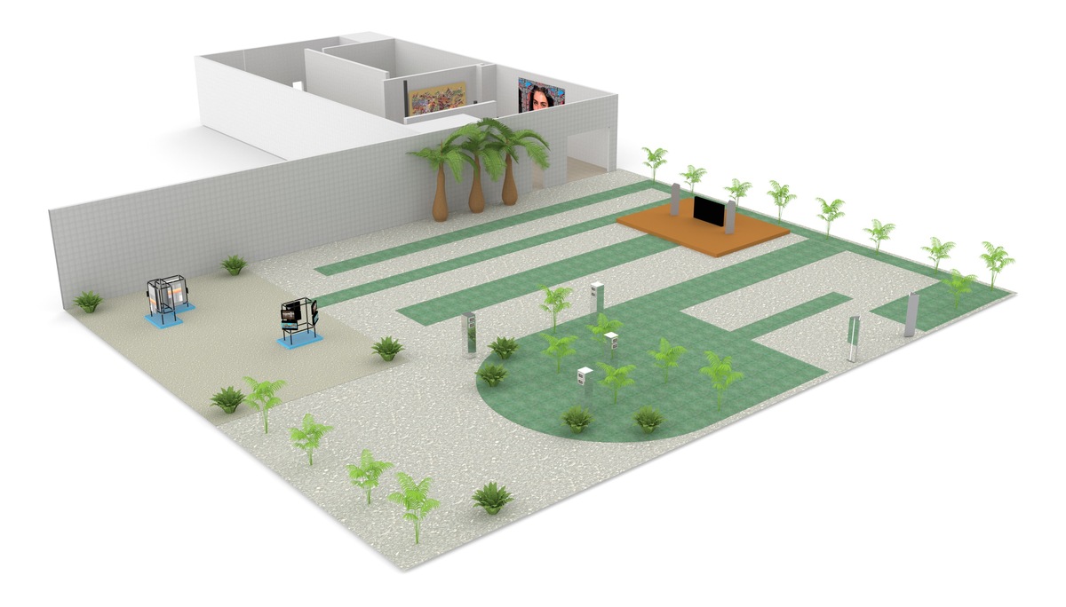
BARROW It’s so important to make sure your display makes sense for the work. There’s the aspect ratio, the orientation of the piece—so you can avoid the weird black bars on the sides of the monitor. But then equally you have to respond to the space. The shows I’ve been doing for Refraction have been groups of fifty or more artists, often showing very different works. It’s difficult to get a feel for everything on display. So I’ve focused more on taking inspiration from the spaces we’ve been showing in. For instance, both last year and this year in New York, we’ve used ZeroSpace, which is an old warehouse with huge ceilings in downtown Brooklyn. It’s very industrial and raw. The installations we’ve designed take their cues from construction sites and old lots. We’ve built structures out of scaffolding pipes and attached monitors to them.
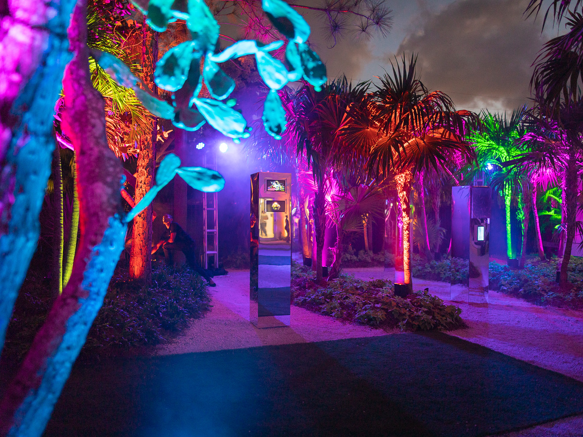
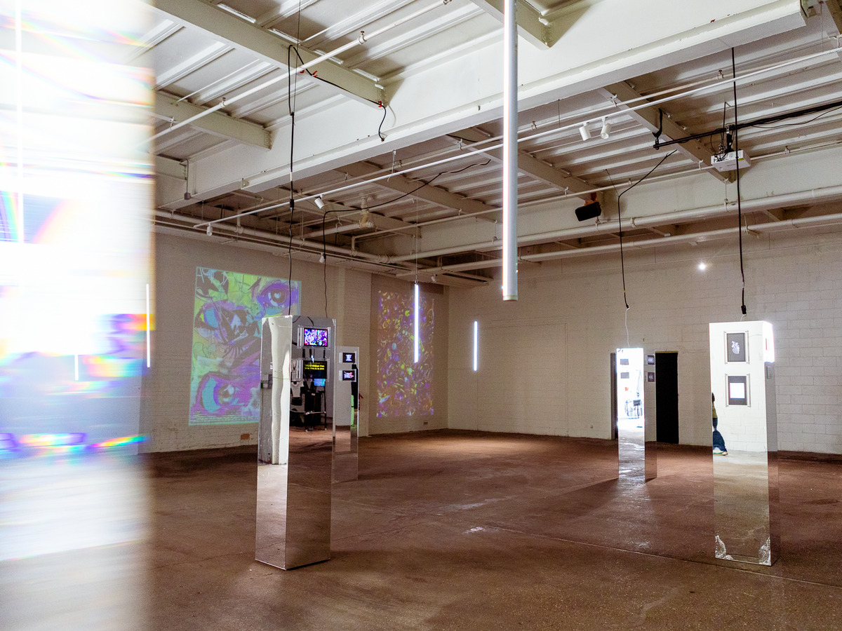
In Miami, we were in an amazing space, which had a beautiful tropical garden area outdoors and a conventional white cube inside. It was flashier, more luxe. So we played with that, using all these mirrored surfaces and bright colorful lights and beautiful plants. I think when you’re working with a load of different artworks, you have to come up with a concept for the overall exhibition. Then, when it comes to placing works, things will naturally slot in and find their place.
HARSANYI I loved the Refraction install in Miami. I thought it was so creative and thoughtful about the particular environment.
When I’m focusing on a particular artist and their intent, sometimes I find that the space doesn’t naturally work, and you have to find a way to make it work. For example, one of the artists in our elevator exhibition used a MacBook Pro. You can’t install a MacBook Pro at the axis that the screen can normally rotate on because you need enough room in the elevator for people to move around safely. You would have to keep it 180 degrees flush to the wall, but that’s not what a MacBook does. So one option we talked about was unscrewing the MacBook so it’s flush, then putting a Plexiglas box over it so that people don’t use the keyboard or bang into it. It’s a bizarre solution, but then it’s a bizarre location.
BARROW That sounds very cool. Ultimately, the essence of design is problem-solving.
HARSANYI Do you see the exhibition design as an artwork in itself as well? I often do.
BARROW Definitely. Of course, you have to find a balance. It’s one thing to consider the individual artist’s needs, but as a result you can lose the coherence of the overall theme. An artist might want to do something one way, but it won’t make sense with the rest of the works. You owe it to all the artists to find a middle ground.
HARSANYI I agree and disagree. What you’re getting at is the role of the curator and their relationship to exhibition design. From the beginning, a good curator is going to think about and choose artists or works that they know will work together in the space.
BARROW That’s definitely the case for some shows, but in the shows we’ve been working on, because of the scale of the events, I’m starting the design before the work is ready. My focus is mostly on the exhibition design—the curation is done by other team members. And it’s such a mix of works. There are often sixty or seventy artists from around the world. Often they’re commissioned to make new work and we give them a very open brief. Sometimes they come up with works that are quite different to what we expected and they’ve shown before, which can create additional challenges with trying to tie everything together.
HARSANYI It’s interesting, because I think I’m trying to move away from commissions unless they make sense for the space and the artist. If I’m talking to an artist for a commission, I will ask them if they have a work that makes sense for the space already or if the space is something that they are interested in working with. For instance, we have this media wall at the museum with a unique aspect ratio, so showing video work on it is nearly impossible. And asking an artist to make a work for that exact aspect ratio means they will have trouble showing that work elsewhere. So instead, I’ve moved to talking to artists who are making real-time, code-based work, which is often scalable without the same problematics.
BARROW I completely understand what you’re saying, and in a perfect world there would be more time to have conversations with all the artists.
Equally, as an artist I make objects which are shown in exhibitions or in collaboration with brands, and I really like it when someone I’m working with gives me parameters—it makes me think in a way that I might not have done before. As I said before, design is about problem-solving, so if the problem is “How do I create an output which I am happy with, but also the person I’m working with is happy with,” to me that’s a question of design. It’s not a barrier—in fact, often it’s led to me finding new pathways for my work. Of course, it’s also important to be selective about who you show with and what you show, so you don’t end up with situations where you’re unhappy with the installation of your work.
HARSANYI That’s a really important point. Artists should advocate for themselves and not be afraid to ask questions to make sure their work is going to be handled in a way they are happy with. And they should expect a good exhibition design team and curator who will ask the right questions of the artist. Many times I’ve had conversations with artists around exhibition design and they’ve said, “You know, I’ve never been asked that before.” They’ve just been told what to do and they’ve said “yes” because they didn’t want to miss out on the opportunity—but looking back they wish they had been able to advocate more.
My research into the history of exhibition design for time-based media is really rooted in spending a lot of time in museums. It’s like watching a movie—the first time, you’re watching the film for the narrative and the dialogue. The second time, you’re looking at the background and noticing smaller details. So, when you spend a lot of time in museums, you start to look behind the screen to see how the projection works, what equipment they’re using. I know a lot of curators who I’m friends with are like this—we start taking pictures just of how things are installed. I’m sure you do this too!
BARROW Oh yes, 100 percent. Whenever I go to an exhibition, I take one or two pictures of the art, and the rest is just install technicalities.
HARSANYI But I didn’t start writing or giving talks about exhibition design from a curatorial perspective in a concentrated way until the whole blockchain phenomenon peaked in 2021. I noticed there were so many bad installations, and that’s what prompted me to look more closely at the history of media art installs. I already had an obsession with Charles Atlas, his advising of the Museum of Modern Art in New York and his installs. I love the look of back-projected images on Plexiglas. Knowing that that was the height of how beautiful a projected image could look in a white-cube space and then seeing all these free-standing screens at blockchain conventions drove me nuts.
There have been curators working on the display of time-based media for decades. I wrote my thesis at graduate school on projection in gallery spaces before the 1960s—the Metropolitan Museum of Art had film projectors which they were renting out to schools in the ’20s and ’30s. Barbara London, who is known as the first video art curator, really pushed the field forward the 1970s. She was showing works in such interesting ways: CRTs stacked on top of each other, or recessed into the wall, or with all their wires sticking out. Then in the 1990s the interest in museums showcasing video art exploded. So, it just baffles me with all that information out why many installations still fail spectacularly in their design.
BARROW I agree. A lot of my inspiration comes from how bad exhibition design can be. It really blows my mind how in this new world of web3 and digital art—which is also becoming quite prominent within the mainstream art context—people think the work just needs to be shown on a monitor with no consideration for everything surrounding it and how it’s experienced.
It can be a headache. With anything digital or tech-based, it’s never just a matter of plug and play. If an artist can get something to work in their studio, that doesn’t mean it will translate in the exhibition space. And if you’re doing a pop-up exhibition, you have to rent the equipment. I always try to avoid putting things on TV stands because they’re usually so ugly, but sometimes you have to work with them. So you order five of them from somewhere, and you design around that, and then the stands turn up and they’re all different from each other. How is this not a consideration for a professional rental company?
With a two-day pop-up, there are also practical limits to consider. Maybe you can’t fix anything to the walls, and you can’t build new walls, or leave any marks, and it’s difficult to run the power around. But I do find that forces you to find more creative ways to show the work.
HARSANYI Even in institutions, curators of media art don’t always have as much technical understanding as they could from an exhibition design perspective, and this can also be true for the exhibition designers they work with. There can still be a disconnect in terms of what it takes technically to install a work. For example, I’m the one programming the Raspberry Pis!
There are also issues to think about with the design of virtual environments. All these spaces, especially when they’re run by companies like Decentraland or Cryptovoxels, cannot take uncompressed files or files at a very high resolution. If you’re showing a moving-image work, they’re probably going to ask you to send a highly compressed version as an mp4. You have to click play and then the work often freezes, or somethidng doesn’t look right. We’re getting far away from how the moving image was conceived to be viewed.
Then there are exhibitions that show work not in a virtual environment but on a webpage similarly to an online retailer. Of course, there is thought around exhibition design—what the background will be, the color palette and its relationship to the thumbnails, whether when you click on an artwork it expands into its own window. But I don’t think this modality has been perfected and in most cases is too inflexible. I also feel that the relationship between the works and the overall exhibition design gets lost when it’s net-based. If you’re clicking on thumbnails and watching works individually, you don’t have the peripheral vision of the other works.
BARROW I think this highlights the importance of physical exhibitions of digital work, to give people the chance to experience the works more fully. Even if you create the perfect website, you don’t know what set-up the viewer will have. They could be on a tiny laptop with a thousand tabs open, or with music playing, or surrounded by posters, or in a badly lit room. They could be viewing on their mobile phone with a cracked screen. But there is something interesting in that as well, about the relationship between design and user experience—and the transformation of the work as it journeys into the world.
—Moderated by Gabrielle Schwarz.
